跳到主要内容
Kimi Gao
首页
博客
关于
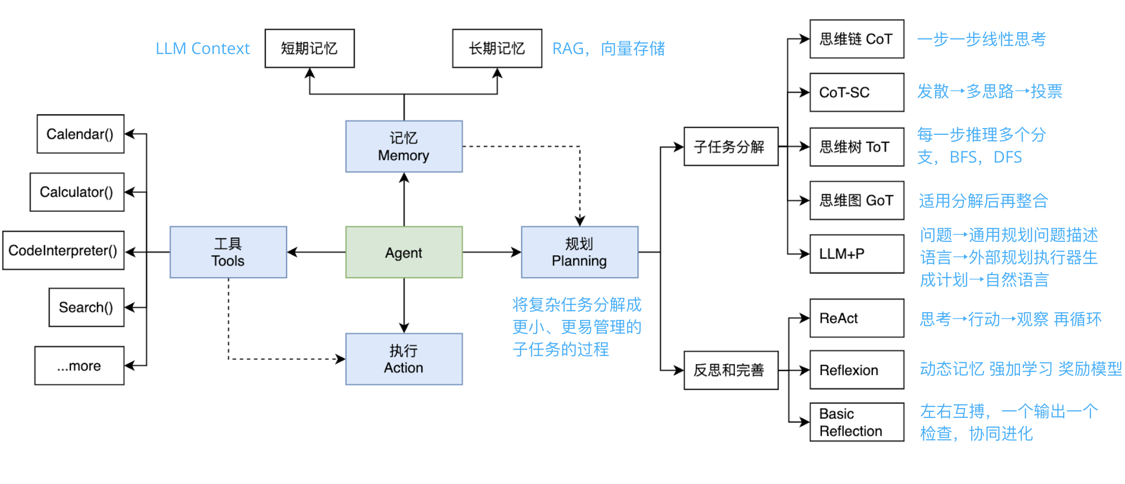
AI Agent 有哪些组成部分?
2024年9月4日
· 阅读需 1 分钟
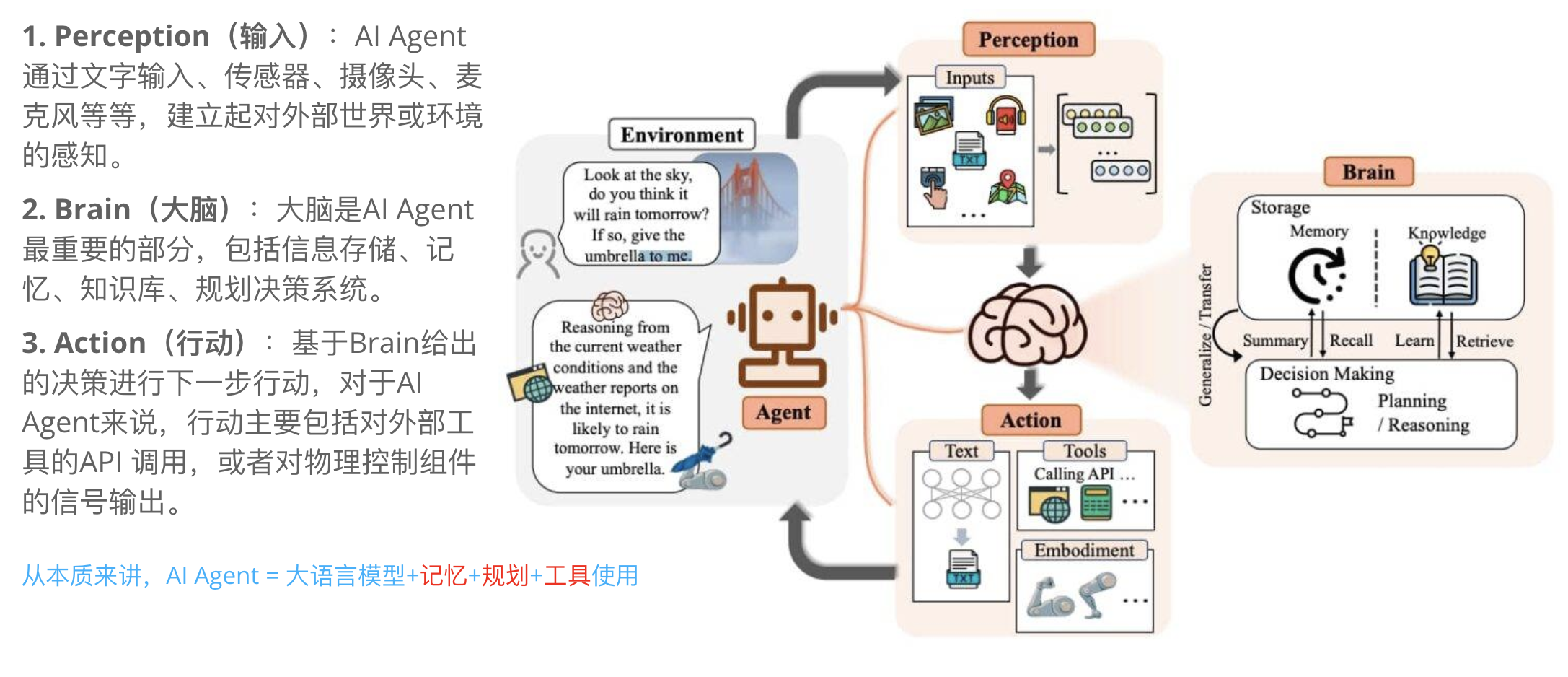
什么是 AI Agent?
2024年9月3日
· 阅读需 1 分钟
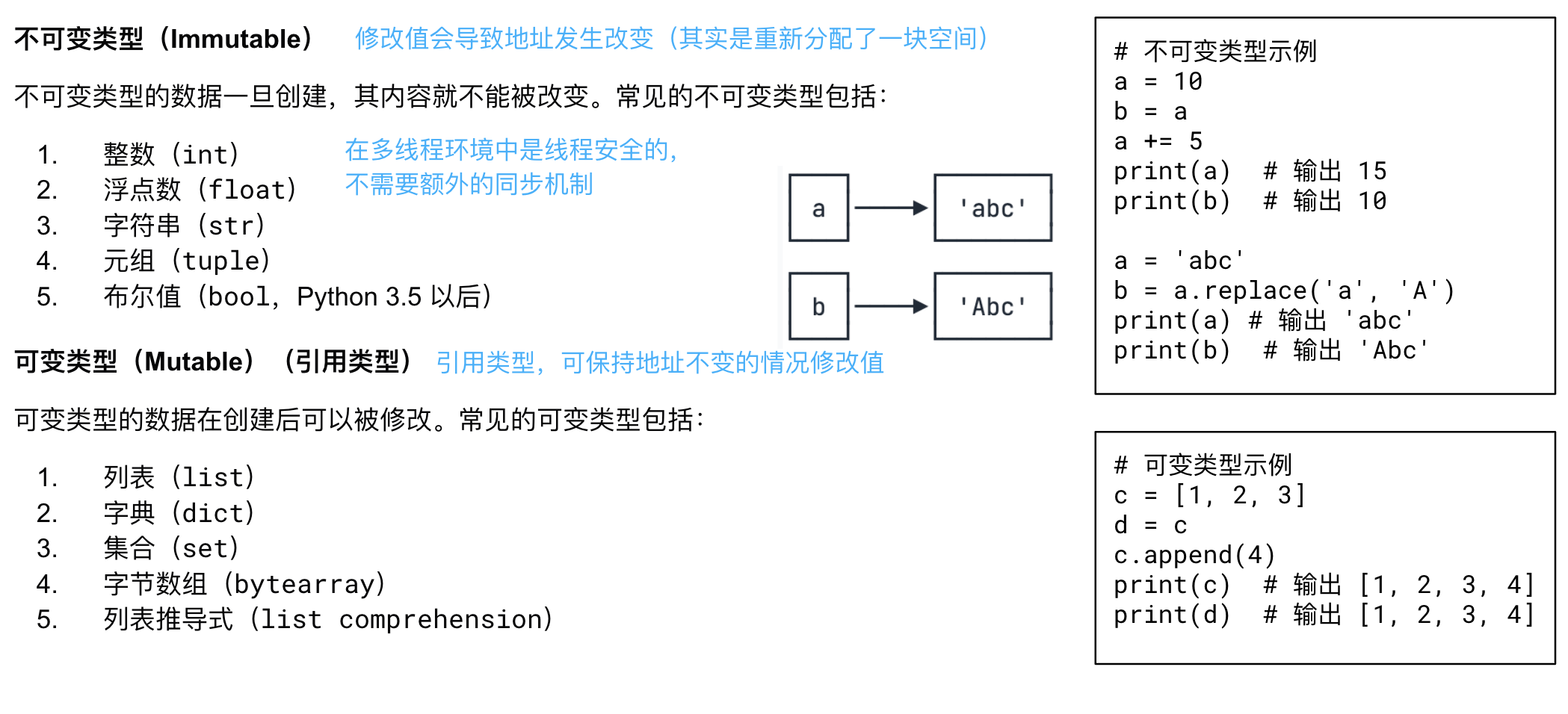
Python 不可变类型与可变类型
2024年9月2日
· 阅读需 1 分钟
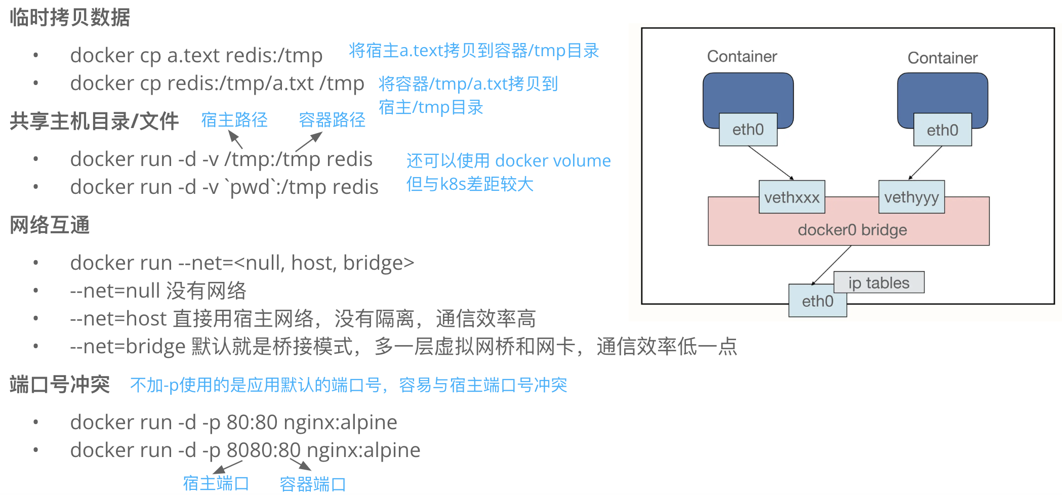
Docker 容器如何与外界进行互通?
2024年8月30日
· 阅读需 1 分钟
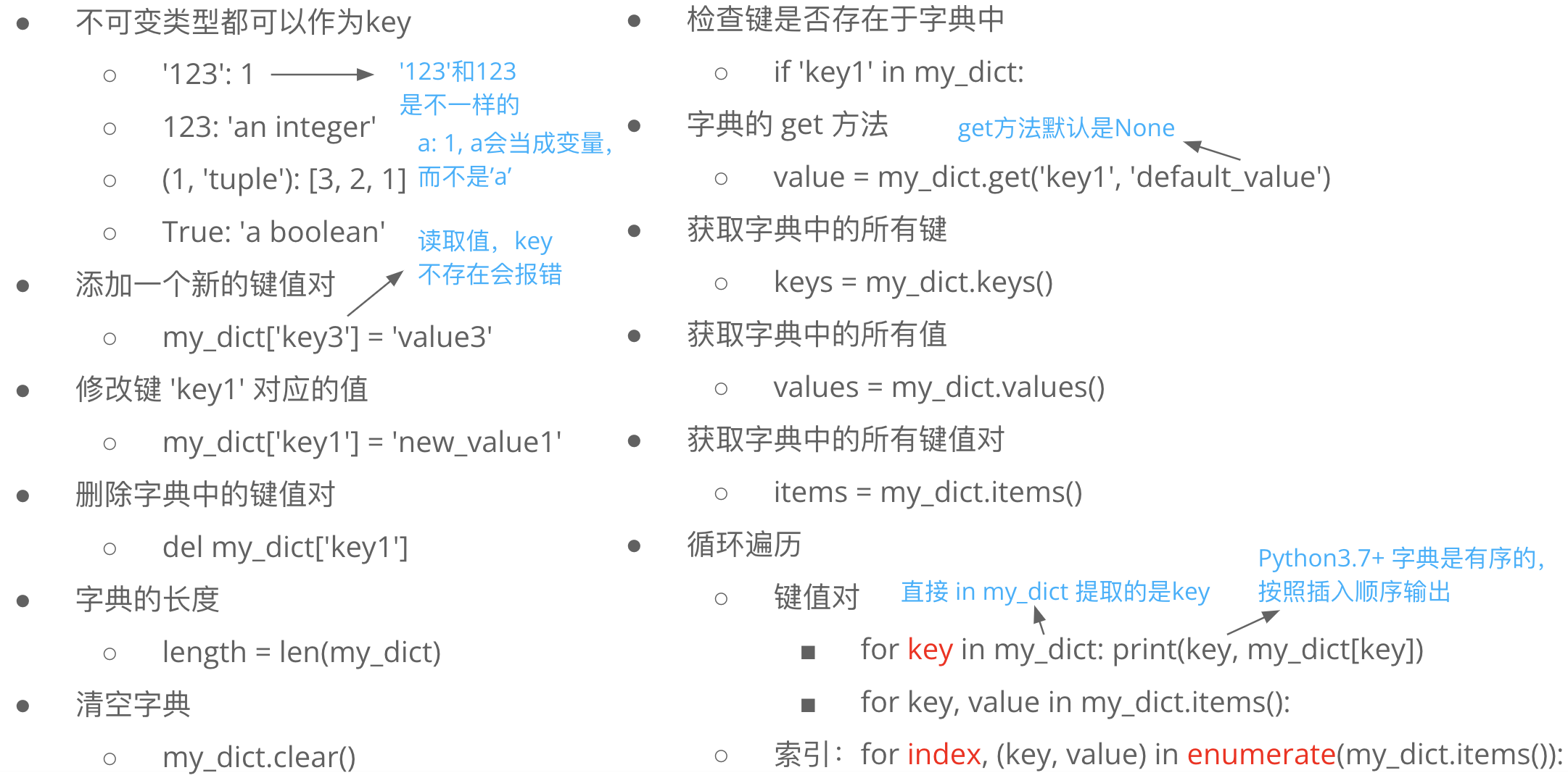
Python dict 使用注意事项
2024年8月29日
· 阅读需 1 分钟
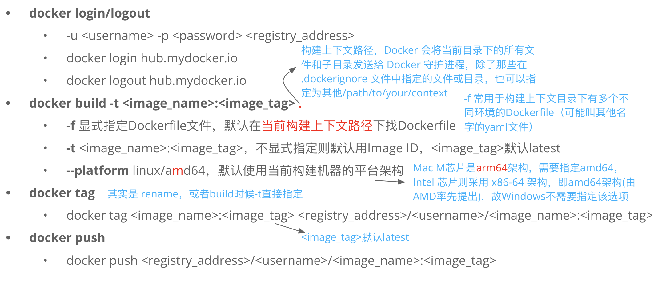
Docker 镜像构建和发布常用命令
2024年8月27日
· 阅读需 1 分钟
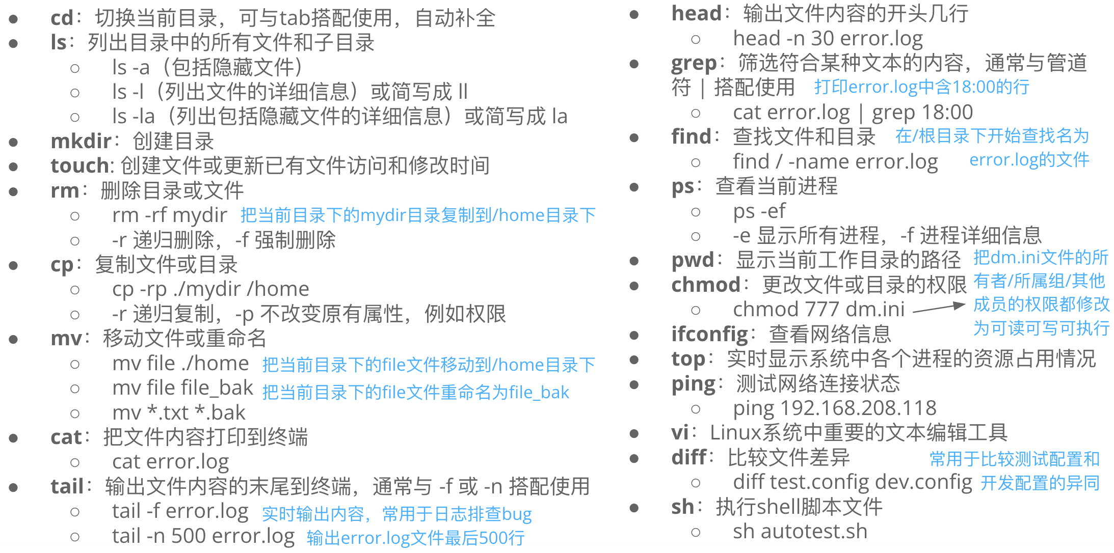
Linux 最基础的常用命令
2024年8月26日
· 阅读需 1 分钟
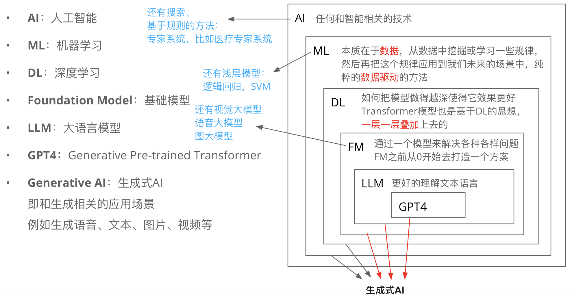
如何理解 LLM 关键术语和它们的关系?
2024年8月25日
· 阅读需 1 分钟
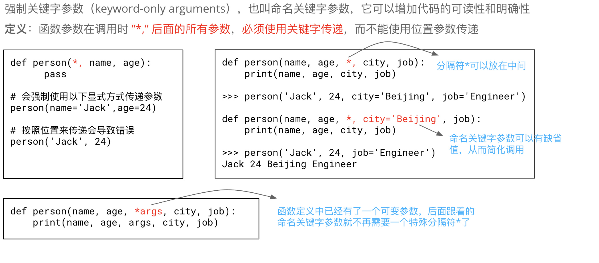
Python 强制关键字参数 *,
2024年8月19日
· 阅读需 1 分钟
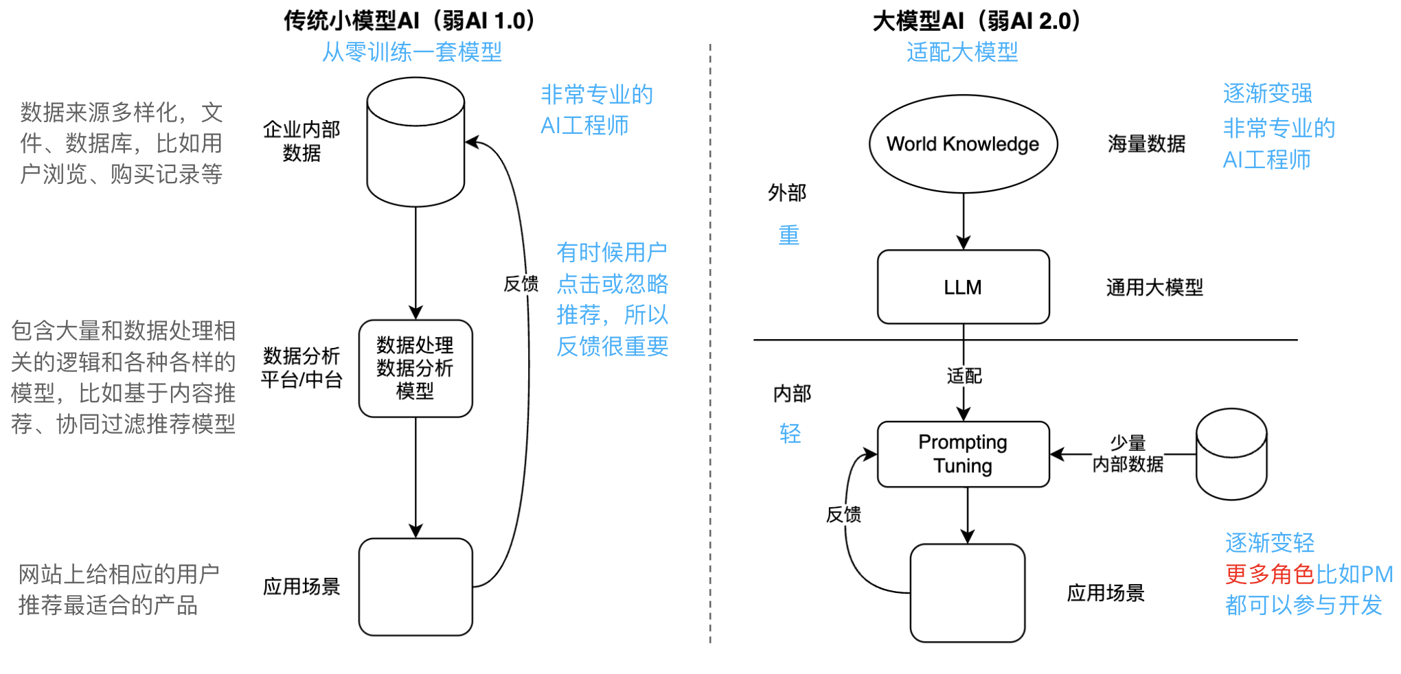
传统 AI 与大模型 AI 之间的区别?
2024年8月18日
· 阅读需 1 分钟
较新的博文
较旧的博文